“Colour…can speak to the soul in a thousand different ways,” said Oscar Wilde, and using this notion to transform your wedding will see you elevate it to a style-forward event.
As ever, whittling your favourite things down to a few can be a struggle, but the shades you select will inform many of the final decisions of your day. Once you’ve nailed the colour scheme, it should be easier to decide on everything from the flowers and décor to the bridesmaids’ dresses and reception backdrops. If your mood board is a hotchpotch of mismatching colour or you’re in the throes of decision fatigue, fret not, for we’ve asked the experts for their advice on how to select your colour scheme, and what they see as the hottest colour trends in wedding world...

Rebecca Marie Weddings / Nina Wernicke Photography
True colours
“Inspiration for wedding colour palettes can be found in a variety of places,” says planner and stylist, Rebecca Marie of Rebecca Marie Weddings (rebeccamarieweddings.co.uk). “We always encourage the couple to explore their personal style such as their clothing choices, home décor and favourite artwork, which can reveal their innate colour preferences.”
Start at home, literally. Is there a colour or combination of hues that you’ve curated in your wardrobe, on your walls and in your furniture? Alternatively, are you drawn to the colours of the natural world, and if so – where, exactly? Are you a sucker for the russet-carpeted woods of autumn, a bright summer’s beach day or the frost-flecked greenery of a winter’s field?
“Nature’s seasonal colours provide a rich tapestry of inspiration,” says Rebecca. “Spring with its pastel blooms, summer’s vibrant shades, autumn’s warm foliage and winter’s crisp whites can all be beautifully translated into wedding décor.” As well as turning to the seasons for inspiration, think about the time of year you’ll be getting married to ensure that the shades will be both well suited and visible.
Make a note of recurring colours to show your stylist and suppliers, who will take everything into consideration and advise you on how to fine-tune your favourites and achieve your final colour scheme.
 Rebecca Marie Weddings / Beth Wilson Photography
Shades of space
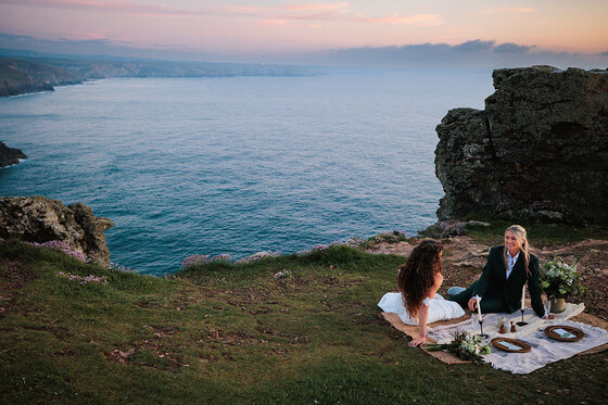
Next, it’s time to consider place. “The architectural style, surroundings and overall ambience of the wedding venue can guide colour choices,” says Rebecca. “A rustic barn wedding might call for earthy tones, while an elegant ballroom could embrace sophisticated neutrals and metallic accents.”
Wedding stylist Nikki Sherriff from Knots & Kisses (knotsandkisses.co.uk) advises a close focus on the venue from the outset. “This will be the backdrop for your day, the context within which everything else will be placed,” she explains. “You want to work with, not against, the existing décor, so you either need to pick your venue with a colour scheme in mind or choose your wedding colours after you’ve locked it in.”

Knots & Kisses / Mel Barnfield Photography
She then advises consulting a colour wheel to create a scheme from scratch. “It’s a really useful tool for figuring out which colours work well together,” Nikki explains. “Generally, colours on opposite sides of the colour wheel will complement each other. I’d also recommend looking at interior design to discover complementary colour combinations.”
Rebecca agrees. “The colour wheel is a valuable tool for understanding colour harmonies and relationships. Complementary colours, such as red and green, create a vibrant contrast, while analogous colours, like shades of blue, blend seamlessly.”

Rebecca Marie Weddings / Jo Cunningham Photography
As well as a process of idea sourcing, deliberation and refinement, colour choice can be a collaborative act between a couple and their planner or stylist. “I often get really inspired for my client's styling plans and mood boards by not only listening to what they're saying about what they like, but also their home and general style if we have a consultation in person (or if I can see their house in the background of Zoom consultations!),” reveals Nikki.
Before settling upon your scheme, make sure you think about the meaning and symbolism, as well as the look and feel. “Incorporating colours that represent the couple’s cultural backgrounds can add a unique and meaningful touch,” says Rebecca, who also encourages couples to envisage their wedding on a thematic level. “The colours should complement and enhance the overall theme, such as vintage Hollywood glamour or bohemian garden party,” she advises. “Gone are the days of Cadbury purple or single colour schemes, which can end up looking dated.”
Remember that most of your wedding’s features will be coloured to suit your scheme, so make sure that you firstly feel comfortable and in your desired mood to happily sit with it all day (and for future days to come whenever you look at your photo album or watch your wedding film). It’s therefore wise to avoid anything too busy and focus instead on how each hue – both separately and together – makes you and your guests feel.
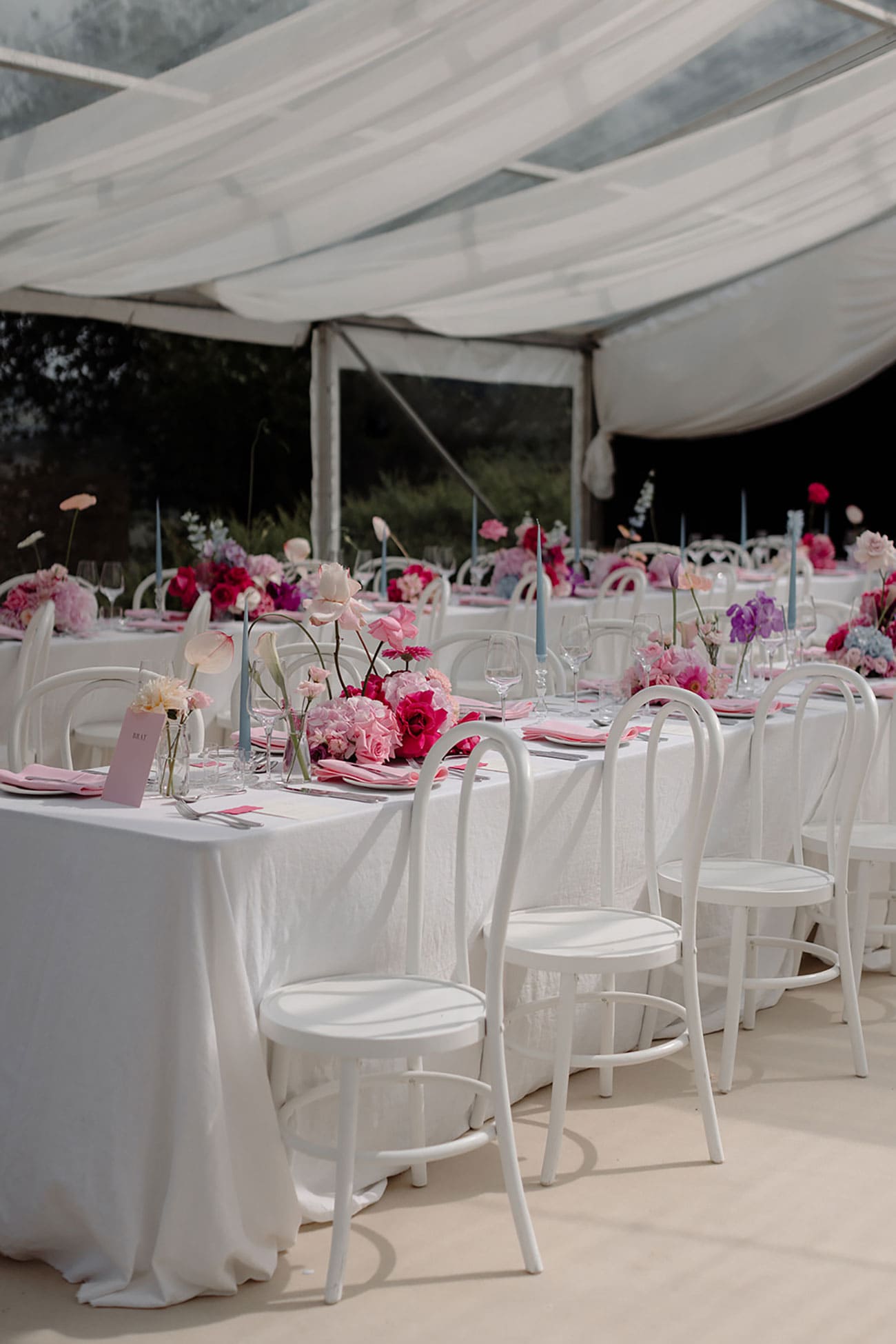
Rebecca Marie Weddings / Nina Wernicke Photography
Hone your hues
Once you’ve established the right mood, meaning and aesthetic that ties in with your venue, theme and individual sense of style and colour preference, you should be able to start mixing your shades to create a harmonious combination.
“I always recommend picking a base palette of two or three neutral shades and then adding two or three accent colours. Remember, neutrals don’t have to be beige or white – if you prefer a darker colour scheme, navy and dark green can be classed as neutrals,” says Nikki.
“And never, ever pick just one colour in the hope you’ll be able to get your entire wedding to match,” she warns. “It will never work! Your colour scheme will look flat, and you’ll be pulling your hair out trying to find the perfect bridesmaids’ dresses or ribbon for bouquets! A broader palette not only adds depth and interest, but it also gives you options.”

Knots & Kisses / Mel Barnfield Photography
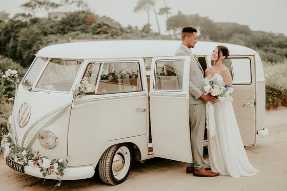
Rebecca also lends a pragmatic eye to the art of colour selection. “Limiting the primary colour palette to three hues ensures a sense of balance and prevents the décor from becoming overwhelming,” she says. “And use neutrals as anchors. Neutral tones like white, ivory, black or grey can provide a calming backdrop and balance out bolder colour choices.”
When it comes to personal flourishes, there are several ways in which you can achieve a bespoke effect. “Metallic accents such as gold, silver or rose gold can add a touch of elegance and sophistication,” suggests Rebecca, who also adopts a multidimensional approach. “Texture and pattern through fabrics, floral arrangements and décor elements add depth and visual interest too – our favourite tool!” she enthuses.

Knots & Kisses / Mel Barnfield Photography
Trending tones
Having recently announced their colour of the year as ‘Peach Fuzz’, Pantone’s top pick looks set to inspire many a couple’s colour choices. “In seeking a hue that echoes our innate yearning for closeness and connection, we chose a colour radiant with warmth and modern elegance. A shade that resonates with compassion, offers a tactile embrace and effortlessly bridges the youthful with the timeless,” says Pantone Color Institute’s Executive Director, Leatrice Eiseman.
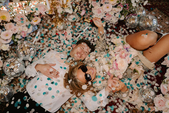
If you’re keen to take a trending scheme and make it your own, Rebecca and Nikki have noted a few emerging aesthetics that may help to inspire and inform your choices. “While classic colour palettes like black and white or ivory and green remain timeless favourites, new trends are constantly emerging and even the concept of timelessness is a trend in itself!” reports Rebecca, who has seen a particular surge in earthy tones. “Terracotta, sage green and burnt orange evoke a sense of natural beauty and rustic charm, and this is very much coming back. Think al fresco Tuscan dinner set-ups!” she observes.
“Couples are still embracing bolder colour combinations, such as fuchsia and lime green, for a playful and energetic vibe. Colourful props such as fruits and bold ribbons are in! Deep jewel tones like sapphire, ruby and emerald add a touch of drama and sophistication; for fashion-forward brides, a fun Marseille Bleu is hot for 2024 – but everything in moderation is important!”

Rebecca Marie Weddings / Nina Wernicke Photography
Incorporating colour into a specific look is another way to make your wedding more ‘now’, as Nikki elaborates. “I'm loving the Cottagecore style and am currently obsessed with adding more pattern back into wedding styling. So scalloped edging and mismatched patterns with full tablecloths are making a return!”
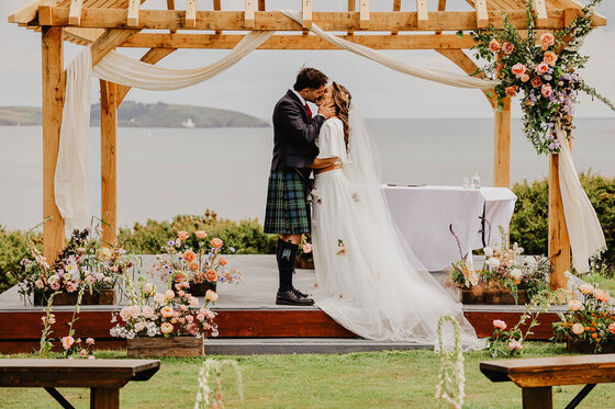
She also advocates for the use of “full-on flowers” to carry your colour scheme with en vogue edge. “2024 is definitely going to be the year for big floral arrangements and statement blooms to make a comeback!” she announces. “I've been asked for so many more full floral arches recently and both myself and the florists I work with have been delighted!”
As long as you use the latest trends as a starting point, rather than replicating them to the letter, you should be able to design a personalised day using your favourite combination of shades with timelessly ‘you’ style. Or, as Rebecca puts it: “The key to selecting the perfect wedding colour palette lies in understanding the couple’s unique preferences, drawing inspiration from various sources and creating a cohesive and balanced scheme that reflects their personalities and style.” If you can look at your scheme and say this with confidence, then your wedding will be very colour happy indeed.

Rebecca Marie Weddings / Nicole Beveridge Photography
Header image - Knots & Kisses / Mimosa Photography

